Jenny's Story
I get so much joy out of finding people with not-so-great layouts, and working with them to improve the overall design and make better decisions for their homes. In this case, Jenny didn't recruit me or even ask for my input. I just felt compelled to help her because I couldn't let her build this home as it was.
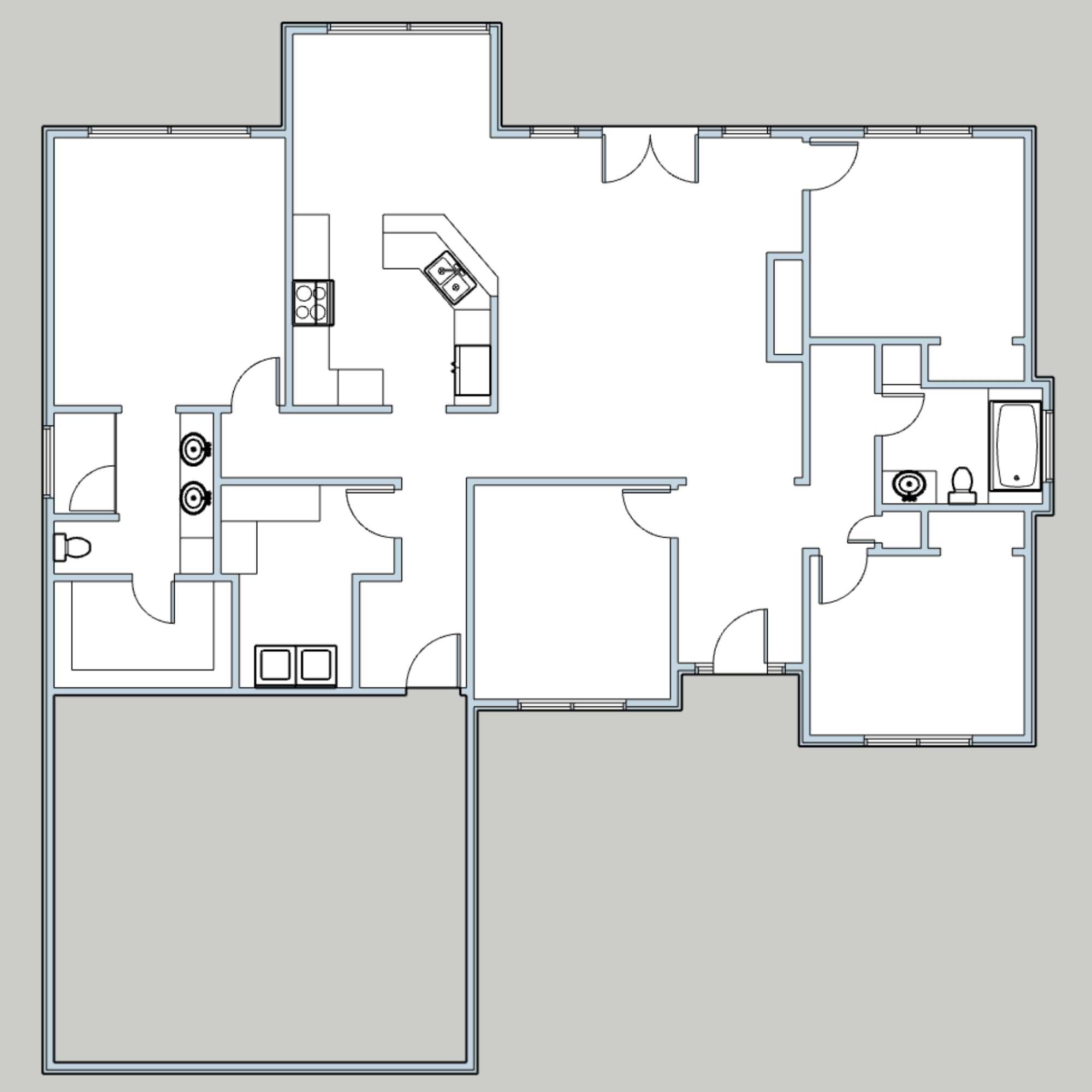
So here's the image I saw first 👇

Jenny was actually asking about the stairs and whether they should be more open or closed. What I saw was the kitchen, and how the cooktop was on the other side of the kitchen from the fridge and sink, completely blocked by the island, on an interior wall. I needed to see the full plan to confirm my fears.
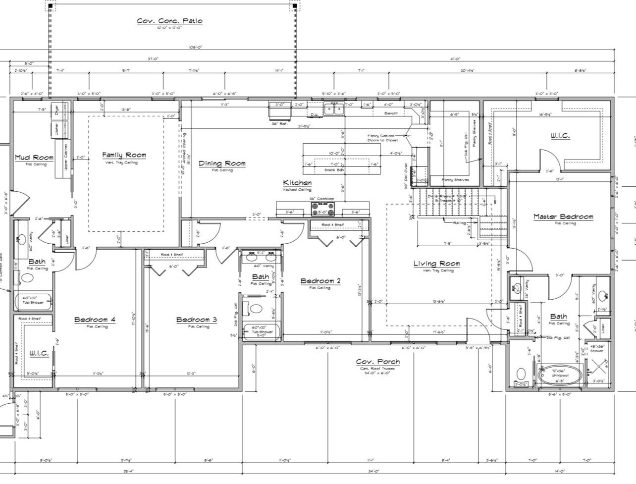
When she sent it to me, 👆 it was as I figured. I couldn't leave it as-is. Her triangle, and therefore entire kitchen and home layout, was completely dysfunctional. Fast-forward a couple of weeks, and I now have a thorough review of the full living space and a pretty great recommendation of what to do instead, complete with the strategy and thinking behind every one of my suggestions.
What I Liked About the Original Plan
The plan did have some redeeming features, of course. Apart from being a great size, the home had:
- A great big window over the kitchen sink. 7' is perfect!
- A big pantry—so much storage!
- Lots of natural light in the living areas thanks to them being on exterior walls
- There is space for a big island with seating
- The kitchen is in the middle of the “L”, which is ideal because it's accessible directly to both living and dining rooms
It's not a massive list. There is certainly more I would change than keep (remember I'm only tackling the big 3 living areas).
What I Don't Like About the Current Layout
Sorry, this might sound a bit harsh, but don't worry, the plan I share fixes everything! I speak a lot about these issues and provide tangible solutions with dimensions and considerations, all inside my online course, Renovation Planning Academy, so that you don't make any of these critical mistakes.
- The necessary kitchen triangle doesn't exist because it's blocked by the island. Any obstruction more than 12” into the space means that it's no longer a triangle.
- The cooktop is in the wrong location. It should be on an exterior wall so that it can be easily and directly vented outside (since there is a second floor above this one). It's also “out in the open” instead of being protected from foot traffic walking past. You never want people casually walking past your cooktop. Imagine you accidentally leave a handle sticking out, and someone hits it as they edge past...it would be so dangerous.
- There is not enough space to sit at the island comfortably and have people walk behind because that's another workstation thanks to the cook top being there. So if someone was cooking at the stove, and someone was sitting on a chair at the island, there would not be any space for a person to walk through there.
- The oven is really far away from the cooktop so if you were taking your cast iron pan off the stove and wanted to pop it directly into your hot oven, you have to walk through foot traffic, quite a ways over, to reach the oven. Ideally these two appliances would be closer together.
- The fridge is exceptionally far away from the living room and there doesn't seem to be space for a second beverage fridge instead to provide drinks to guests.
- There is some mention of a “bench” under that second kitchen window. I'm not sure what that is, but if it's a lower seating area for lounging, then this is a big no-no. You don't want someone hanging out in the protected kitchen zone where you should be prepping and cooking. It's standing room only back there!
- The corner upper cabinets in the kitchen are the worst use of space. Never do corner uppers.
- The current living room layout doesn't offer many good options for placing furniture.
- Some people disagree with this point, but I would never recommend having a front door open up into a living room. I don't like the idea of having my lazy zone at the front where strangers who show up at the door can see my kids watching TV in their jammies. I always prefer the living area at the back of the house.
- I also always suggest that the living space be the one that's directly next to the kitchen (if you can't have both the living and dining rooms “attached”), so that when you're in there cooking, you're still within earshot of the conversation happening in the living room. This is the entire point of being open concept—so that the cook can be involved or at least hear what's being said in the living area. Where the living room is now, you're just slightly further away and out of earshot.
- The “hidden pantry” doors are awkward because they stick out into the space where they are, and you wouldn't want to just walk through them and smash someone on the other side. It also just doesn't make sense to have doors that look like a cabinet next to countertop spaces with upper cabinets above. It only makes sense in a pantry wall where all cabinets are 24” deep so the doorway blends in.
Major Things I Would Change About This Layout
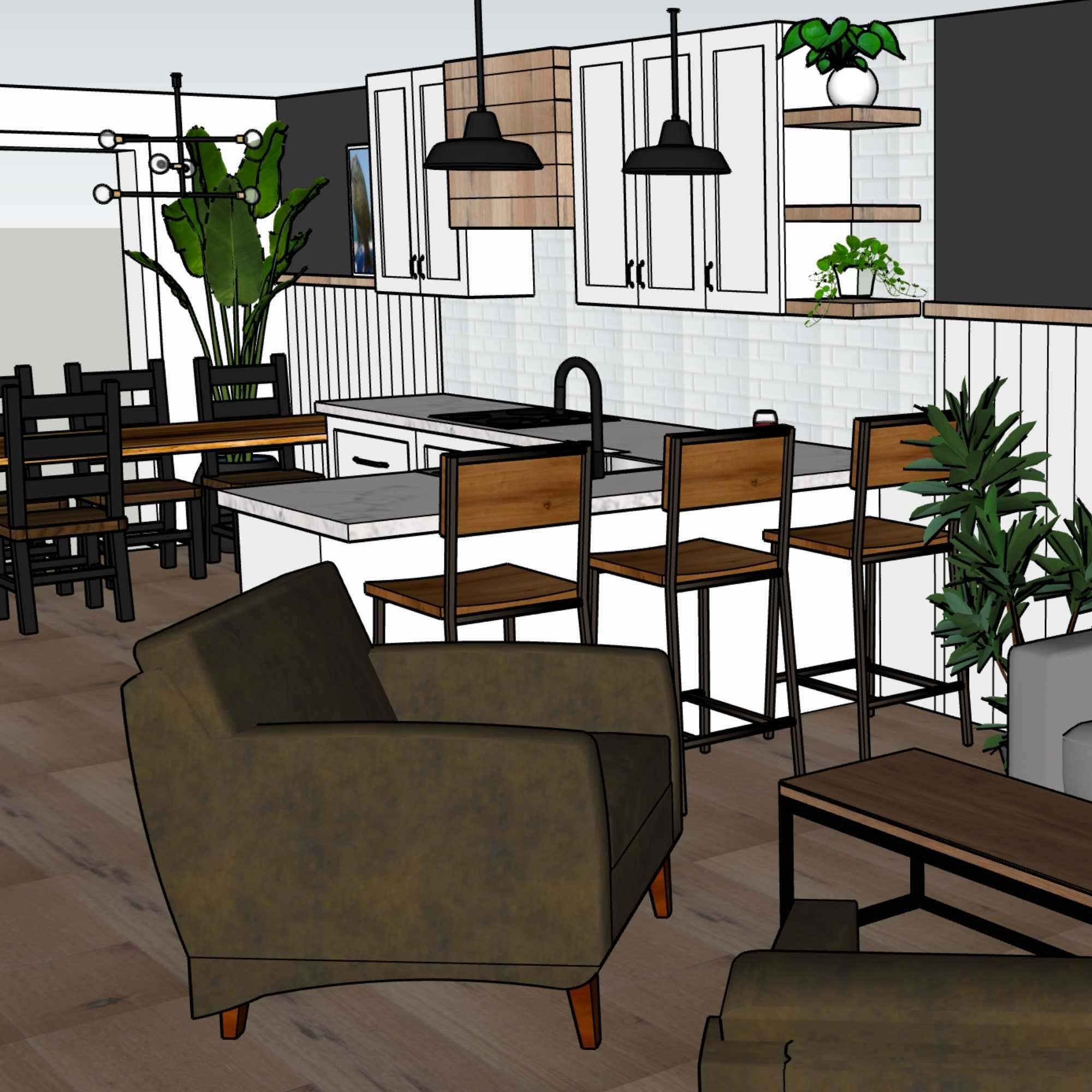
In order to demonstrate the changes, I've created a new layout in SketchUp and overlaid it on top of the original. This way, the new layout is still in the context of the greater space. I will explain the changes room by room so that we can see zoomed in images of each space as well as the entire floorplan as a whole.
Here is the “existing” layout again, without all the dimensions and plan details getting in the way.
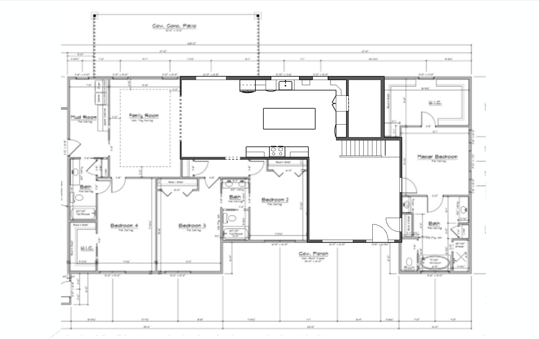
And here is the new layout, zoomed out like the original, so that it's still within context.
Here are the changes:
Living Room & Dining Room Swap
The first decision I made was to move the dining room to the front of the house where the living room was. Here's why it made sense:
- Most people spend less time in the dining room, so it makes sense to keep the lesser-used space at the front of the house.
- The front room is less connected to the kitchen thanks to the stairs, so that's an ideal spot for dining because it's close but slightly out of earshot. This is good because any prep between courses or putting dirty dishes in the dishwasher will be less noisy while dining. Also, the host is only doing quick trips to the kitchen and back (hopefully) so won't miss much of the conversation.
- The front view is likely to be not as good as the back, which is also ideal for dining. While eating, you want the view and focus to be the others at the table. You don't need the beautiful view that only half the people will be able to see because the other half will have their back to it.
- The living room should be most connected to the kitchen and back patio. When you're in the living room, that's when you want that connection to the exterior and the view. You can position your furniture such that the view is the primary focal point.
- The improved kitchen layout makes serving easier because the fridge is closer to the dining room now.
- The new social/bar/coffee zone (where the cooktop used to be) is now perfectly positioned for serving the new dining room area (and living room) because it can have a little bar sink for guests who need water and shouldn't go into the triangle.
- Jenny has a large covered patio off the back [new] living area, which presumably will be used for alfresco dining all summer. This means that the back of the house will really be the hub for living, so it makes sense to have the living room next to it, rather than have two dining areas side by side, with one gathering dust for a few months each year.
- Based on where the stairs are, it's better to have the dining room here for noise transfer. I get into this actually a little later in the [video/article] but just generally, unless you're in Europe, most people are not sitting around their dining tables when little kiddies are trying to fall asleep AS MUCH as they are sitting around their living room either having raucous conversations or watching louder movies. So if you had to pick between the two spaces to have next to your stairs, the dining area actually makes more sense because people usually talk a bit quieter when they are eating. Then, once they are done eating, if they need to move because the toddler just won't go to sleep with them being loud, they can easily have their dessert in another room. But you can't watch movies in the dining room just to avoid the noise transfer.
- The above reason also applies to the Primary bedroom suite, which is right next to this front space. The last thing you'd want as a parent is for your kids to be up late watching a movie after you go to bed, and the loud TV is right next to your bedroom. It's much better to have the dining room next to your bedroom and the living area further away.
Kitchen
The overall footprint and layout of the kitchen was amazing to start with, which is why this layout shift was both easy and overall quite minimal. I didn't need to move walls or take over any other areas, and all the rooms are very generous and beautiful. The biggest changes I made, then, were really to do with rearranging the appliances so that Jenny could enjoy a tight and protected work triangle. I speak a lot about this, and describe way more inside my online course, Renovation Planning Academy, so that you don't make any of these critical mistakes.
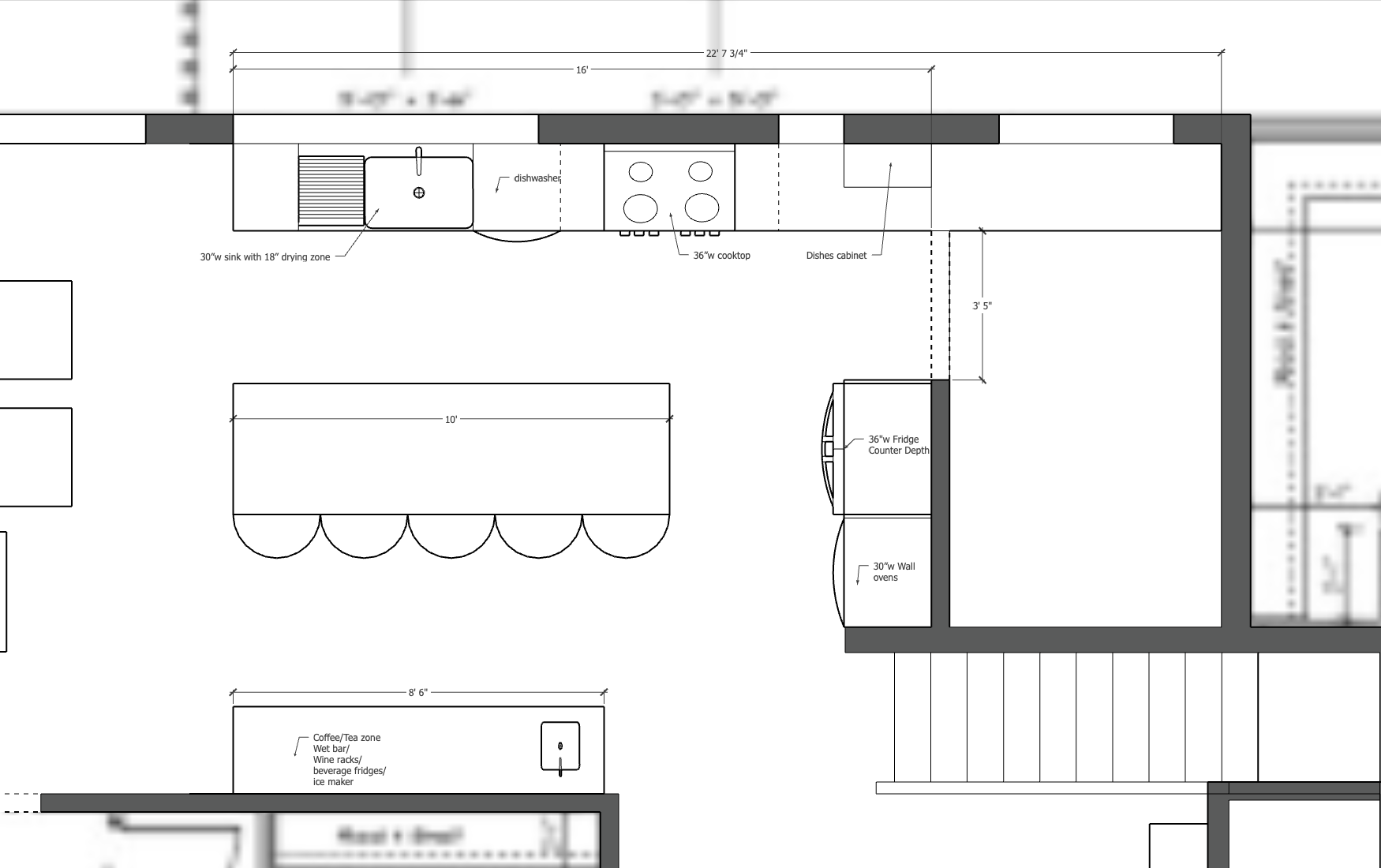
Here's what changed:
- The kitchen footprint has been reduced on the left side so there is enough room for a large living area. This was easy to do, since the kitchen didn't need the extra space, given the size of the pantry. The pantry is clearly an important piece to this family, so I'm not changing the size or location of that. However, I am updating the access a bit to flow better with the new kitchen layout.
- The range was moved to the exterior wall so that it can be easily and directly vented. Now, too, it's in the middle of the kitchen work triangle, which is ideal, since it's the most dangerous and needs the most protection from those wandering into the space. Most non-cooks only need access to the fridge or sink while cooking is in progress, so it's best to keep those on the outer edges. (The previous location of the cooktop was next to a traffic highway, which meant that anyone walking past to get through to the rest of the house was in danger of touching the hot stove, or getting splashed, or any number of accidents. You never want to have your cooktop out in an open thoroughfare like they had it before.
- The space where the range was will become an amazing wet/coffee bar area that could contain a small sink on the dining room end, as well as a bar, a small beverage fridge and/or ice maker, the coffee machine, a kettle, a popcorn machine…really whatever this family would get the most use out of in that space. It can be customized for their needs. Having the prep sink there gives them flexibility for it being all of those suggestions because the plumbing will be there. This zone means that people can be pouring wine or making coffee in the kitchen, while not being in the precious triangle area, so it's wildly functional to have.
- Pantry access was updated so that the exterior wall countertop flows fully into the pantry instead of seeming like a totally separate room. This flow allows for more natural light to be shared in both spaces, and won't make the pantry feel claustrophobic. If Jenny really wants to be able to close off the pantry, a special L-shaped pocket door could be crafted and installed that would perfectly slide over the countertop and right up to those lower cabinets and block off the space when really necessary. For the most part, I envision it being left open to allow for easy access to secondary appliances like the microwave, blender, toaster, toaster oven, etc.
- The fridge was moved to the pantry wall beside the double ovens. It grounds the kitchen here, blends in with the other deep appliance, provides access to the dining area for those mid-meal milk top-ups, and is perfectly accessible on the outer side of the triangle. This also makes it really convenient for giving the back of the fridge the necessary airflow, should it need a vent back there into the pantry. It's harder to do that on an exterior wall, which often means the fridge needs to stick out into the room a bit.
- The corner cabinets were removed. Corner units are terribly useless and you can't reach the things in the back. Just have a flat one that goes to the edge and then no cabinets on the return wall. In this case, it was replaced with a half-depth but full-height cabinet to house most of Jenny's flatware and glasses. There are also drawers underneath which are perfect for most dishes. Special glasses for guests, dining, wine, or other specialties could be stored in the new wet bar area since they are more specific in their use.
- The island was reduced by 12” in depth. I don't know what the “snack bar” was referring to, so this might be something they want to keep, but I shrunk the island a bit to only be a maximum of 3' deep (36”) instead of 4' (48”). This change still allows for full 24” depth cabinets on the working side, and a full 11” overhang for seating on the other. That's more than enough, especially when there isn't a sink in the island. This update means that the walkway behind the island changes to 4.5' (54”), which is recommended because of the large traffic flow to both spaces on either side of the middle kitchen behind those island stools. You need a wide walkway so that people don't have to edge or squeeze past the people sitting at the island. For the amount of traffic, you really need 48” as a minimum so that the traffic doesn't have to edge around a chair, and those at the island don't have to scootch out of the way. I would love to see 60 or 72” in a space this heavily used, but I will take the 54” and keep the wet/coffee bar nook that's shown.
- The sink location, centred on the 7' window on the back exterior wall, was perfect, though it shifted along a few inches to make room for the cooktop being next to it. The dishwasher was swapped over to the right side, since that's the side closest to the cooktop and prep space, where you want dirty dishes to pile up. The clean dishes will be placed on the left side of the sink so that they are furthest away from the messier zone.
Dining Room
The new dining room is perfectly sized for a gorgeous 8-foot table. It has the ideal clearance of 4 feet on all sides, is perfectly framed with the window so that the table will receive all the natural light and 9/10 guests will be able to see the exterior while dining.
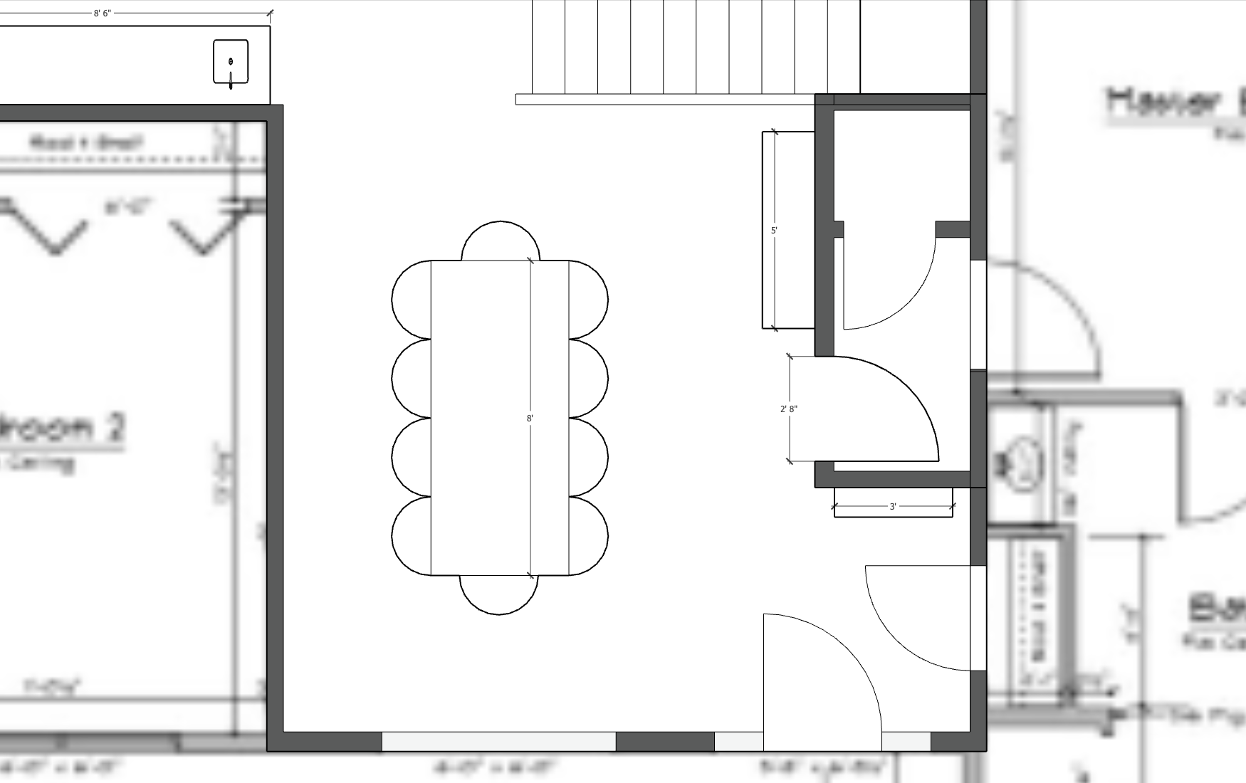
Aside from adding a table, I've implemented a new wall on the right side of the room. Here's what this wall does and why it's important:
- The wall creates a more formal entryway nook because it's a tiny bit enclosed now. The new wall provides space for either a bench and some coat hooks above for easy hanging, or what I would do, which would be to have a small shelf or console table, with a lamp, and a mirror above it. This makes it easy for guests to come in, put their phone down on the shelf/table (because you know they've been holding it), take off their coat, check that they look ok and didn't get ravaged by the wind outside, and then come in. Shoes can even be tucked under the table and out of the way.
Now you have a functional, though still small, entryway for guests that feels like an entrance. It feels intentional, not like someone has just interrupt your movie or TV show. It's now a separate little pocket. AND it provides some privacy. If a stranger comes to your door and you don't want them to see everything happening inside your home, now all they see is themselves reflected in the mirror. WIN. - The wall provides utility to the dining area. Before, it was a bit of an awkward space, either as a living room or a dining room. There was nowhere to put art or dining area storage because the bedroom door was right in the center of the space. And really, who wants to see right into a bedroom? Nobody. And just closing the door is not sufficient. If you want to go in there to use your own bathroom instead of your public powder room, then people will see the bedroom when you open the door, and maybe that's not the worst, but I just feel like more privacy would be nicer.
So with this plan, you have a double door system AND with the door further down at the end of the wall, it leaves a beautiful little nook next to the stairs for a large, beautiful display of furniture and art. Here's where you can add additional lighting in the form of wall sconces or lamps, and you have extra storage space in a hutch or built-ins, whatever you need here to serve the dining room. Now it's a great place to put the bottle of wine, or just put some extra food you don't want on the table. It provides utility and style. - The wall provides storage utility to the rest of the home. The area under the stairs previously was kinda useless because it wasn't full height, but now, once that space is closed off, it can be used to create an additional storage space for anything. It's not huge, but it makes use of this previously unusable area. The rest of the vestibule provides added privacy for the primary bedroom suite, as well as extra sound insulation if kids do stay up late playing a loud board game at the dining table.
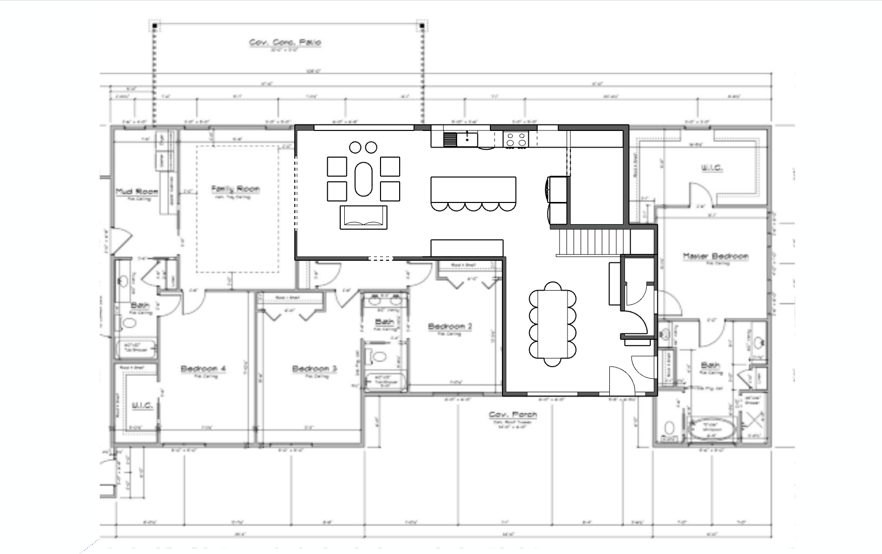
Living Room
Since I didn't ask Jenny about her priorities for living room inclusions and activities, I don't know what she might have been planning. Is the living room supposed to be a TV area, or just a space for guests and reading? This is the critical question only she can answer.
In addition, in the original layout, there is a wide entryway into a family room that was left open to what was the dining area. I don't know if that family room was where they intended to do their family living, and if that would have the TV, leaving that front room just for formal guest entertainment, so I'm just going to provide two options for layouts in this area that I think would work, but of course more permutations are possible based on Jenny's priorities.
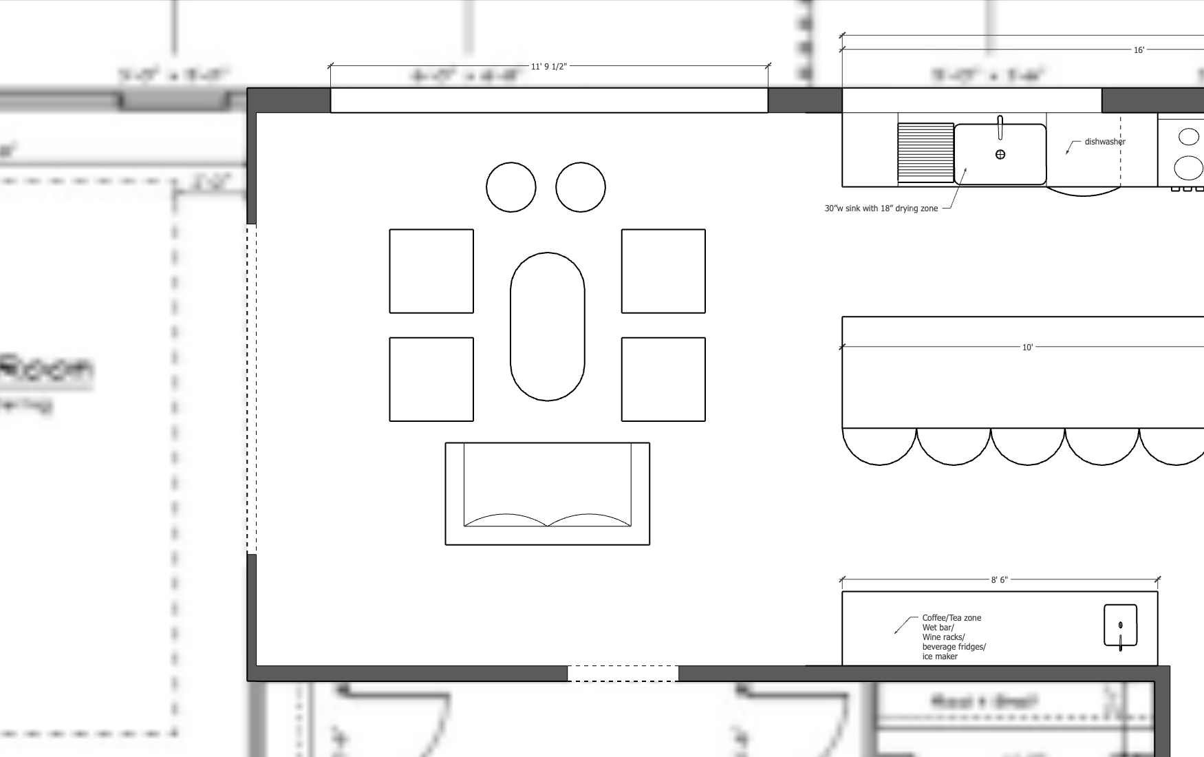
OPTION 1
First, if we wanted to leave it open so that kids could play in the family room, and that was where the main TV watching would be, then the living area would not need a TV or really anything, so i would open up the back wall entirely with as big of an accordion door (or windows) as possible, and let guests and family enjoy the view. Since the covered patio is outside this door, (which I would screen in!), then these doors could be open all summer without bugs. This would be the absolute optimal indoor-outdoor experience and would be amazing for guests and family time. What an incredible flow.
In this layout, the view is the priority, so the furniture is placed so that people gather and enjoy each other's company around a coffee table, able to enjoy the space and the light from the view. The little round things could be ottomans, but really this room could be whatever Jenny wants.
OPTION 2
If this living area is supposed to be the TV zone, or if Jenny just wants a different focal point than the view, then here's another plan. I would still do the massive door to the covered patio, but I would shift the main room orientation toward the other wall. To do this, we'd need to close off the family room a bit more instead of having it so open.
In this case, I would make the door much smaller (though I've left a very roomy 5') and I would perhaps install an oversized barn door (on the family room side) so that there could be some separation between spaces but it wouldn't feel very closed off. This would free up 9 feet of wall space for some built-ins, a fireplace, a TV or a library, whatever sort of style and combination Jenny would prefer here.
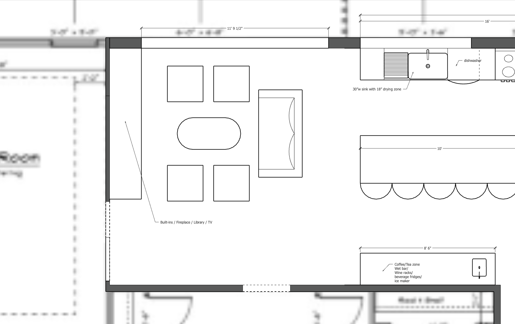
Living Room Summary
The point of these two options is to show that this is a versatile space, with loads of room for furniture, so it really comes down to the homeowner's preferences, as always. But I LOVE the connection between this room and the outdoor patio. It's just spectacular and will be an amazing living space for this family. I hope that they decide to open up that back wall and let the outside into this new living area.
Jenny's Stairs
The funny thing about Jenny's story is that she didn't ask me (or anyone) about her kitchen layout at all. It was only something I noticed and then asked her for her plans.
Jenny's original question was actually about the staircase, and if it should be open or closed. I love an open staircase because I think stair design has come a long way in the past few years and we can have really beautiful stairs that are a real feature of a space in and of themselves. As an added benefit, staircases that are open to the adjacent rooms don't block the flow of natural light from other areas or upstairs into the lower level, and can themselves be lit by the natural light of those lower level adjacent rooms, so they will feel more open and luxurious.
But of course, anything that's a feature is going to be expensive so for me, this question almost always comes down to budget. Is having a beautiful staircase worth the money? A closed staircase is almost always going to be cheaper because it requires significantly less detailed finishing. So while it uses up more material overall (studs and drywall finish, presumably), those are faster to execute and less expensive materials than other guards like metal spindles or a glass rail.
The only other considerations are regarding sound and the separation. If you're worried about sound travelling from an adjacent lower level room up to bedrooms or other spaces above that need more sound reduction, then certainly having the stairs closed off will help with the noise transfer. But you need to ask yourself, is it necessary? Kids and teenagers sleep through a lot, especially if you have a loud fan or other white noise helping to drown out sounds. If it's just for the rare times you have that really loud friend over, maybe you can just deal with it or hang out in a different room. I already discussed this part earlier so I won't revisit it. That's how you consider the sound element.
Regarding separation, I think in most cases, stairs can be left open, unless you need it separated for some specific reason. If your stairs came down beside an office, bathroom, or other bedroom, instead of a living/dining room, you'd need to close those off. Otherwise, the only other reason I might suggest it is if your furniture needs dictate that you NEED it to be a wall. I think it's a rare circumstance because normally you can be creative with furniture, and ideally you wouldn't have it against the wall anyway unless it was the only spot you could put your TV or a fireplace. So really, it's just if you had your grandma's old hutch that you NEEDED to keep and didn't have another space for it, or you have just the perfect piece of artwork that can't hang anywhere else, so you need that wall space. Those could be compelling reasons you'd want to close off the stairs and have a wall instead of letting the stairs themselves be the feature.
The summary? It really comes down to you and your preferences and budget. But those are the considerations to think about when you make the decision for your home.
In Jenny's case, I recommend keeping half the staircase open, as shown in the 3D model, and then closing in the second leg after the landing, since that will now be used for storage and giving the dining room a wall area for furniture and art. This solution offers the best combination of beauty and utility since it shows some of the open stairs, but still offers some separation between floors.
Summary & Action Steps
Those are all the changes I would make to Jenny's living areas. I hope you found this interesting and also informative for your own renovation or new build. Getting the layout perfectly right takes some time and strategic thought, but homeowners can do this work themselves with a little guidance. My online course, Renovation Planning Academy, is opening up soon for enrollment, so hop over and get your name on the waitlist so that you can be first to sign up. Alternatively, if you can't wait, go and watch my FREE Masterclass now to receive a special offer and a chance to enroll right now.
Thanks for reading this post. If you'd like me to review your home layout, email it to me at karen@barncatreno.com. If I think it's concerning enough to demonstrate the flaws in a blog post, I'll give you my 2 cents and create a video about it for free. Might as well ask, right? Otherwise, a formal layout review like this is a service I charge for. (This took a REALLY long time to prepare!)
However—I do offer a layout review as a FREE BONUS inside my Renovation Planning Academy course, which is incredible value, so jump into that masterclass now and see if joining RPA is right for you today.


 How to Beat Overwhelm with Your Home Renovation
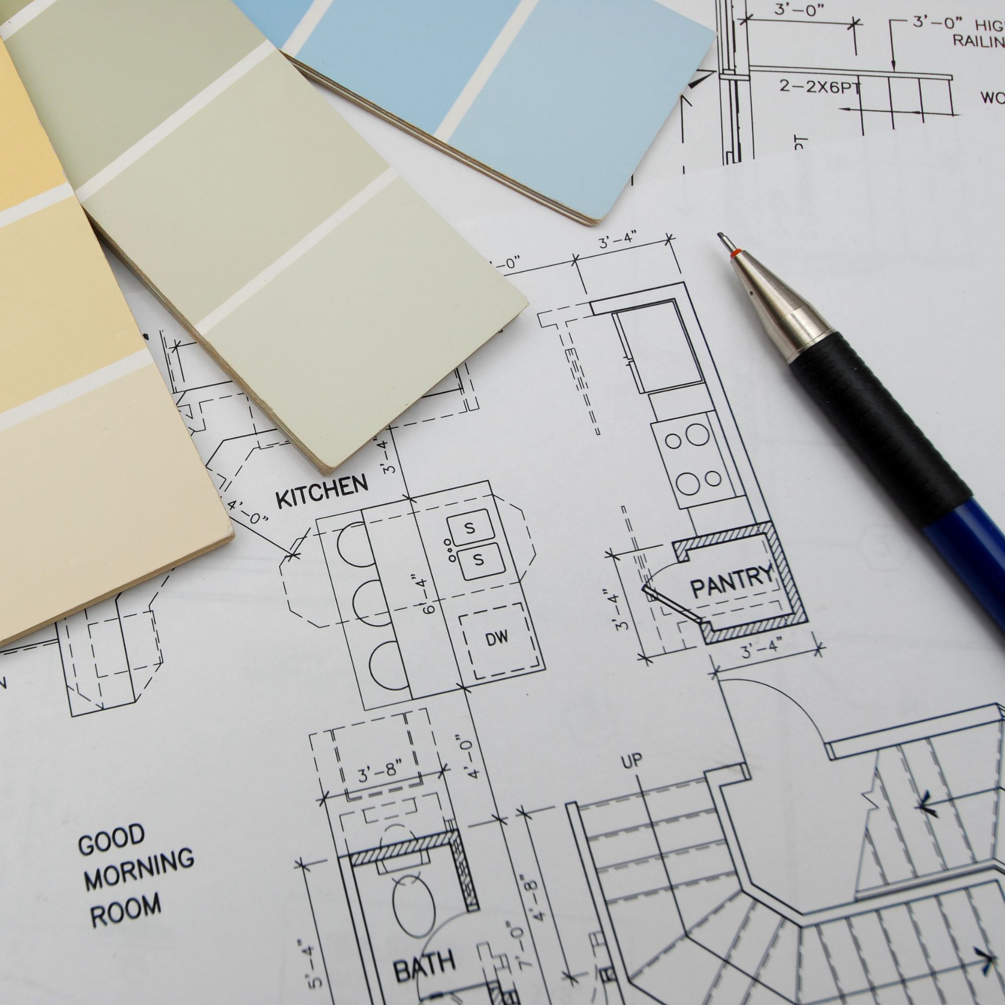 The Important Documentation You Need to Guarantee a Successful Renovation