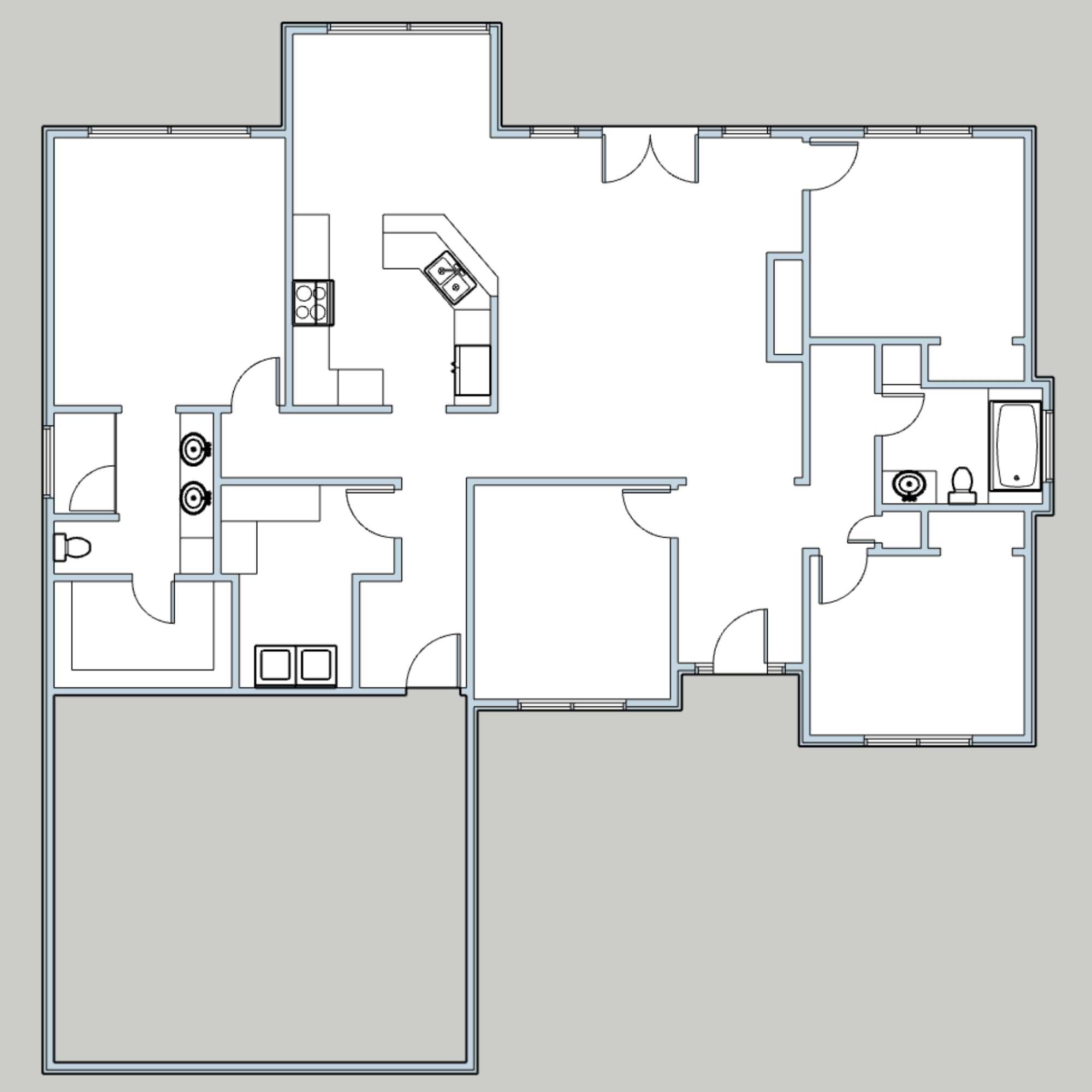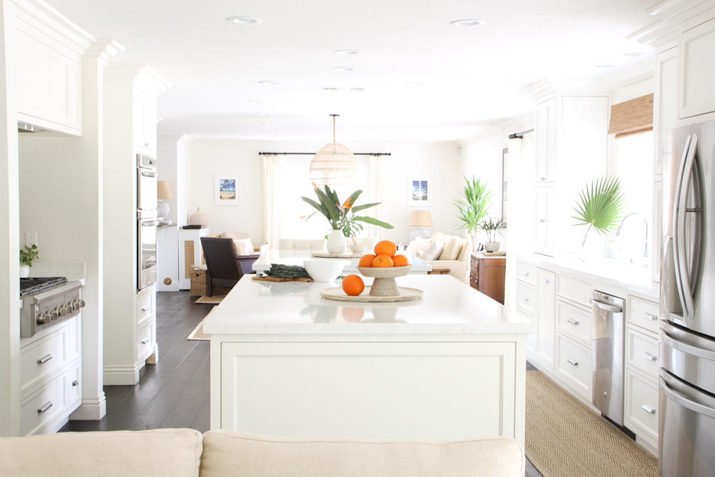
Today I will be reviewing a kitchen to identify all the things that work and don't work with the layout and design. I came across this particular kitchen on Pinterest and at first thought it was quite nice with some really smart features. After a few minutes, I found a zoomed-out image and was able to understand the entire layout.
Girl, was I ever shocked!
Why Is a Kitchen Layout Important?
If you don't already know this, assessing and figuring out perfect layouts is one of my all-time favourite things to do. We spend so much time in our kitchens every day, and having a layout that doesn't function just makes me incredibly angry because it doesn't have to be that way. The kitchen is the most important and sacred part of the home, and if it's not designed in a way that makes it functional for daily food preparation, then you might as well cook off a camping stove in your designer living room.
Kitchens have to be done right, and that means they must be so much more than just pretty. Anyone can paint cupboards and throw up a nice backsplash and fresh countertops - but none of that matters if the space isn't functional. I believe this so strongly that I don't even find these types of spaces beautiful anymore. For me, the beauty in a space is totally derived from its function, flow and usability. My main objective in every single renovation plan is to design a space that is functional first, and then it's very easy to apply some styling. When a home has excellent structure and layout, then it hardly needs any makeup to be beautiful.
To say I'm slightly passionate about this is an understatement.😉
I will be sharing strong opinions on this one, and I know not all of you will agree 100% with me. DM me on Instagram or email me if you want to share your thoughts. I always love to hear your feedback. Here we go!
The Current Layout: Double Island Galley Kitchen
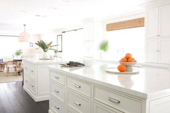
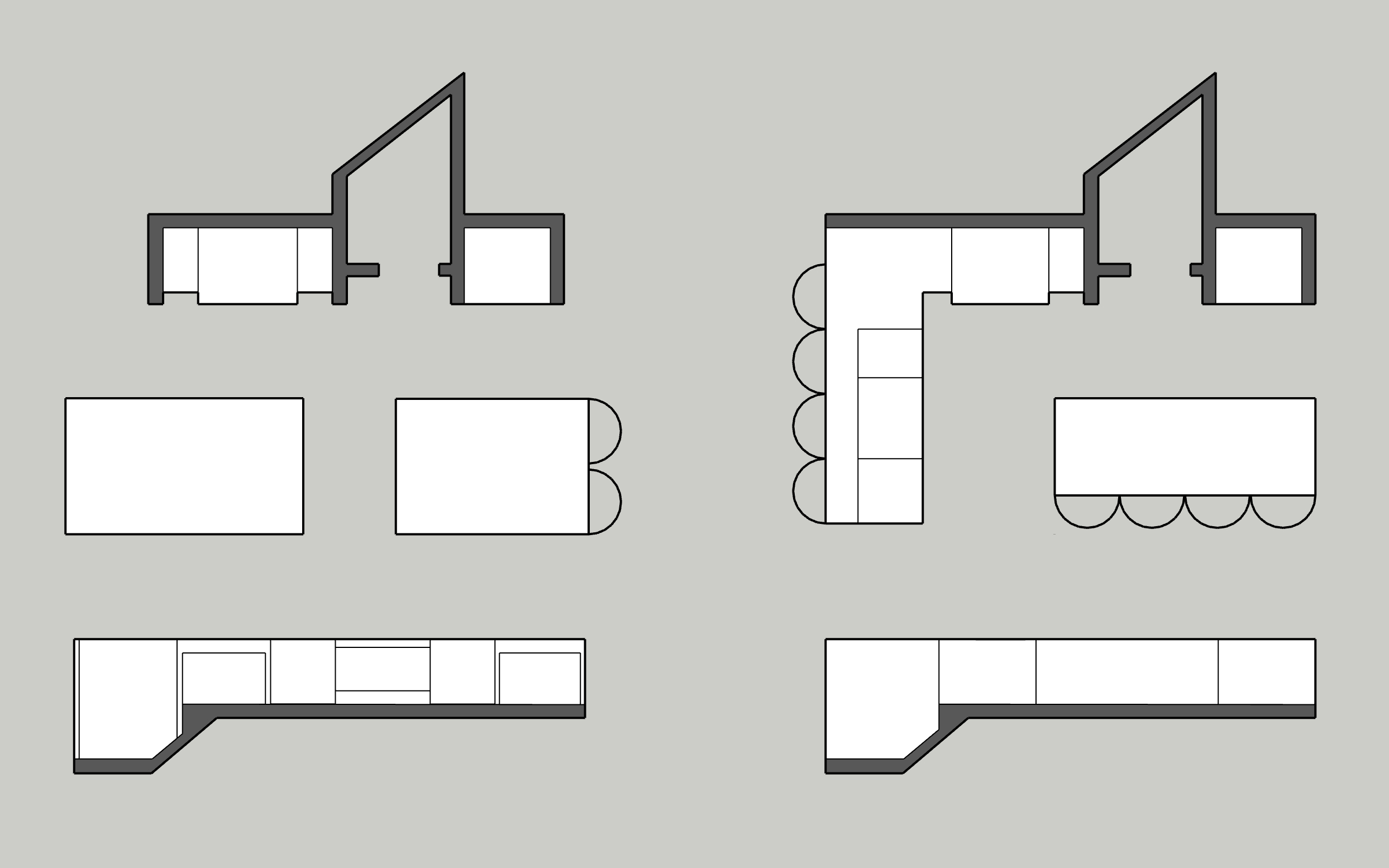
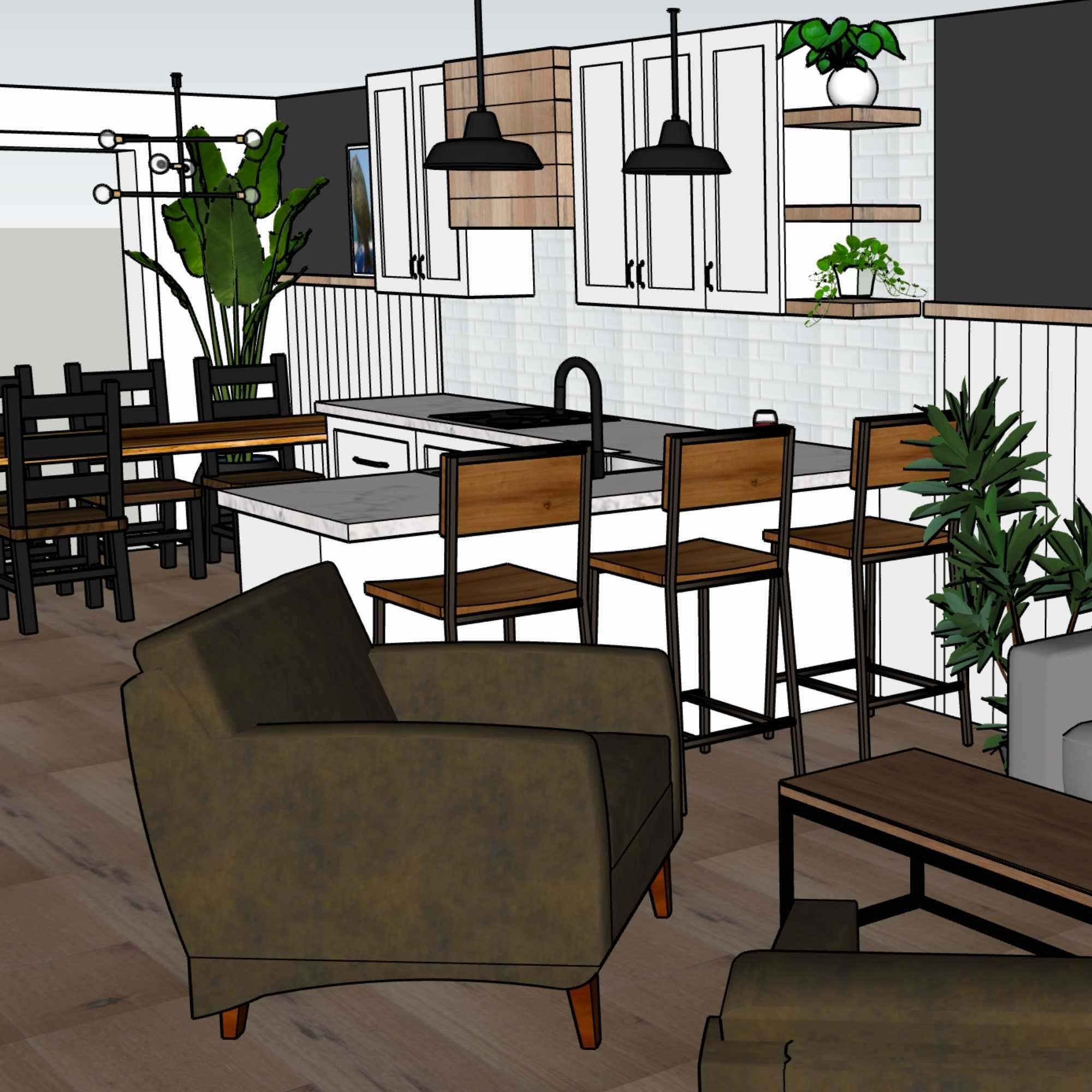
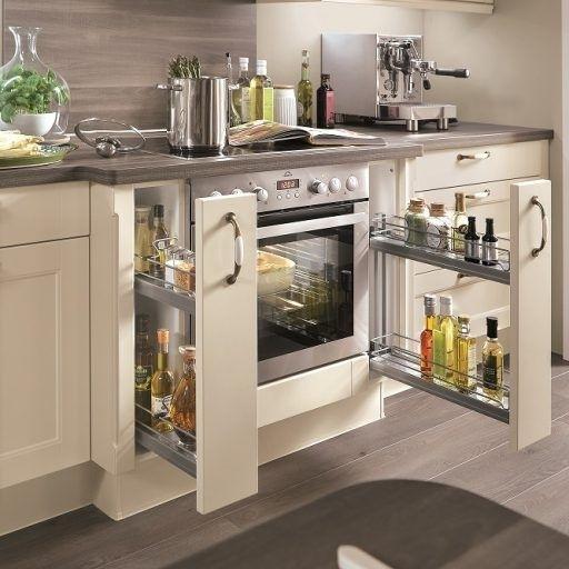
This is the photo that originally caught my attention. Pretty, eh? In order to fully understand the layout, we need to see a 2D plan view.
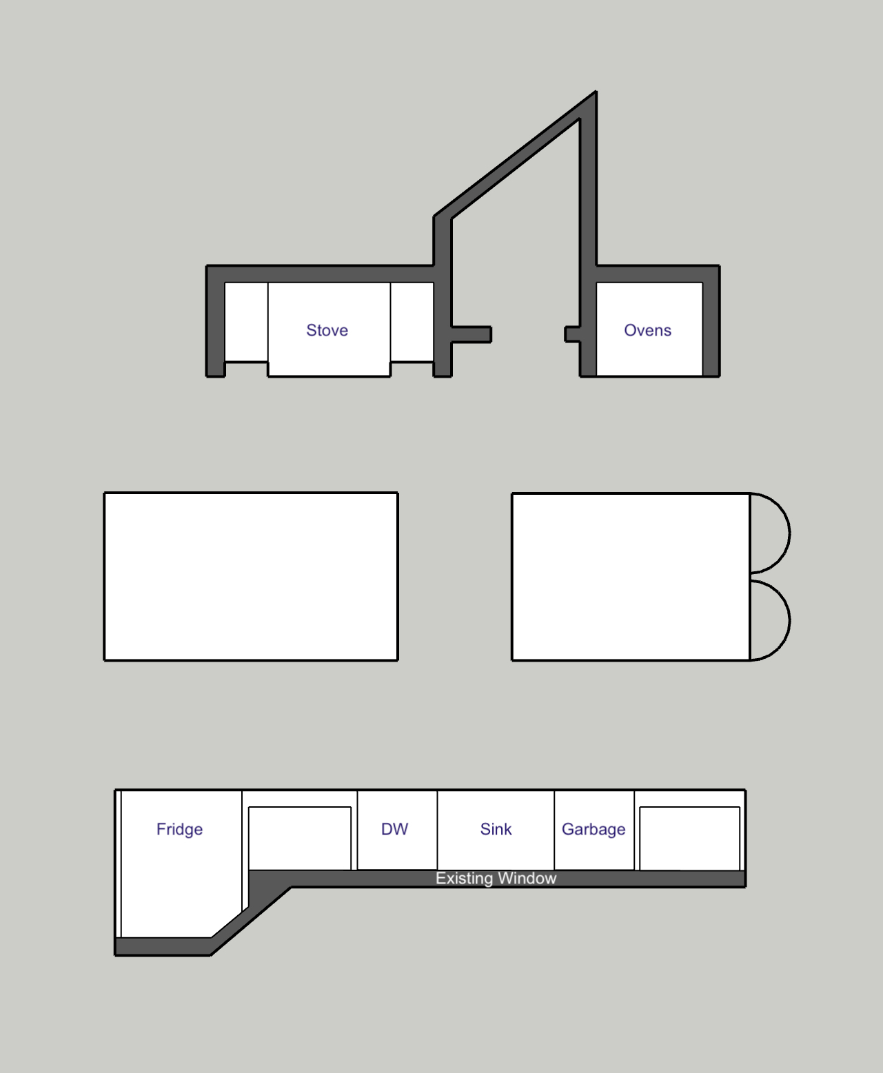
Things I like about the layout
Let's start off with some positives to get the ball rolling.
- The sink is under the window. I always love having something nice to look at while washing up dishes.
- The ovens (double = heaven) have a drop zone. A drop zone refers to the spot where you can quickly put hot things as you take them out of the oven or off the stove. With the island directly opposite the oven, it's easy to pop down a couple of trivets or a cooling rack and quickly rest something hot. I see a lot of kitchens where the wall ovens look beautiful, but don't have any nearby counter space for placing hot food. You need somewhere to put that large tray of roasted veg while you close the oven door, right?
- At least the islands are separated. If they had just done a single large island down the middle, it would have been an epic fail. At least they left a space between them so that it's a bit easier for getting from one side of the kitchen to the other.
- Loads of storage. The islands do pack a huge storage punch. I am also a major advocate of choosing 100% drawers for lower storage instead of traditional doored cabinets. Drawers offer better and more storage, easier access, and overall a more functional experience than having to get down on the floor and pull things out to reach something deep in the back of a regular cabinet. I also love having upper cabinets span from the top of the counter all the way to the ceiling. If you have ample prep space elsewhere in your kitchen, then why not make better use of that 20" for making every day essentials (plates, cups) more accessible for our smaller family members.
Problems with the layout
If you could imagine yourself trying to make dinner in this kitchen, you might agree that this layout makes that task difficult. Here's why:
No Triangle
Some people might argue that the triangle concept in a kitchen is outdated, and yet it's held true for so long because it is indicative of how people actually use their kitchens to cook. People often take fruits and veggies out of the fridge and immediately wash them at the sink, so direct access is important. People also need to fill and drain pots of water for stove-top cooking, so quick and easy access between the sink and stove is also essential. Finally, when the pan is hot and you need the butter quickly, you don't have time to run far away to reach the fridge, so you need quick and easy access for that as well.
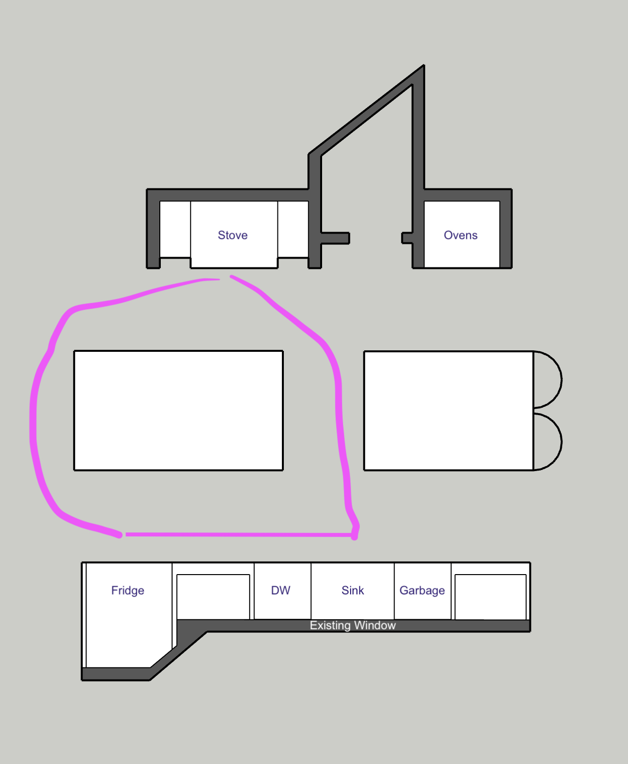
The triangle concept is tried and true because people usually travel amongst the fridge, stove and sink often while they are prepping and cooking. As a result, the three need to be close together and have nothing in the way of that path. This kitchen has ignored this most important concept and instead left the stove all the way on the other side of the kitchen, hidden behind an island. The path is more of a large, pointy circle than a tight triangle. It's very inconvenient to get to the stove when the dinner rush is getting frantic and kids are having meltdowns. And can you imagine navigating the path to the sink when you're carrying a huge pot of boiling pasta water that you need to dump out without tripping over someone?
Limited Seating
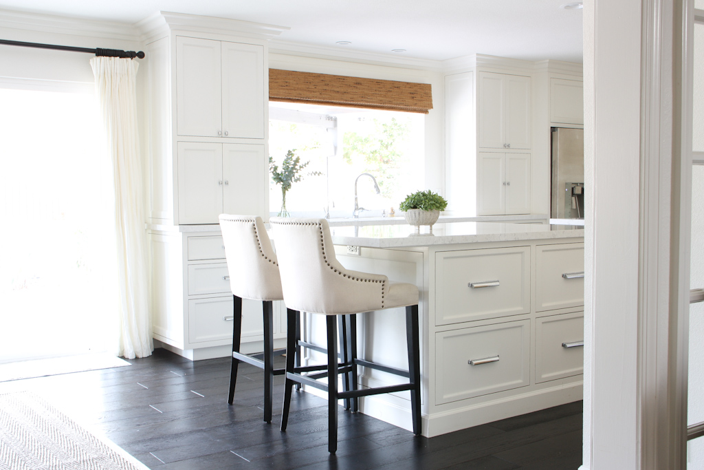
This kitchen only has two seats at the far end of the island, which means that people who want to be part of the kitchen action but not in the way of the cook don't have a great option for positioning themselves. Yet, that's the whole point of having an open concept home, isn't it? Interactivity and connection are precisely why we knock down walls, but if there is no easy, close, designated place for friends and family to sit while you're in the kitchen, then the function just isn't there.
In this layout, the cook would have to do all the prep over on the far island to chat easily with people on the stools, but it's a far walk from there to both the fridge and the stove. There would definitely not be any conversation with those people in the stools while the cook is hard at work at the stove. And if people came closer to the stove, they would just be in the way when the cook needed to quickly get to the sink.
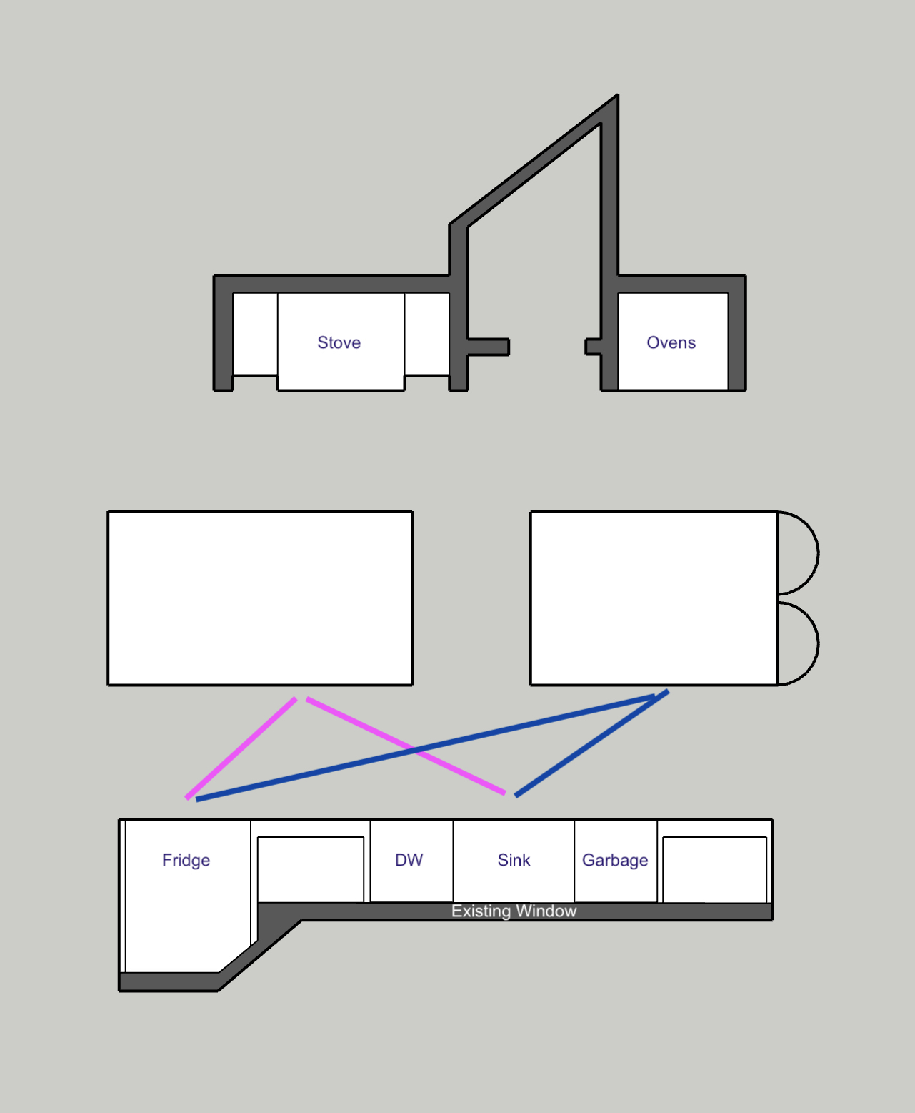
The most convenient prep space in the whole kitchen is the island directly opposite the fridge and sink. The cook has a great little triangle there for chopping veggies or making a marinade, and it would almost seem like the other side of that island would be great for people to sit. But unfortunately, the stove is back there, so it's one of the worst places for people to hang out. There really is no good option provided here for friends or family to be part of the kitchen action yet out of the way.
No Designated Pathway
This concept is closely related to the other two points, but is still relevant as its own kitchen design principle. There is no single designated pathway for people to move through the space without being in the way of the cook. There are 2 paths through the kitchen, but both of them are key spaces for the cook to be actively working during meal prep time. So for kids or guests who just need to get to the other end of the house, or to move from the living room to the dining room to eat, there is no way for them to move through without potentially being in the way. It's important in a kitchen to have a designated space that is just for the cook(s) and another clear path for the rest of the family or guests to move through or past the kitchen without being inside the sink or stove parts of the kitchen triangle.
A Better Kitchen Layout Solution
I can't just complain about this kitchen layout and not provide a better solution, so here what I would have done if I was planning this renovation and why it works:
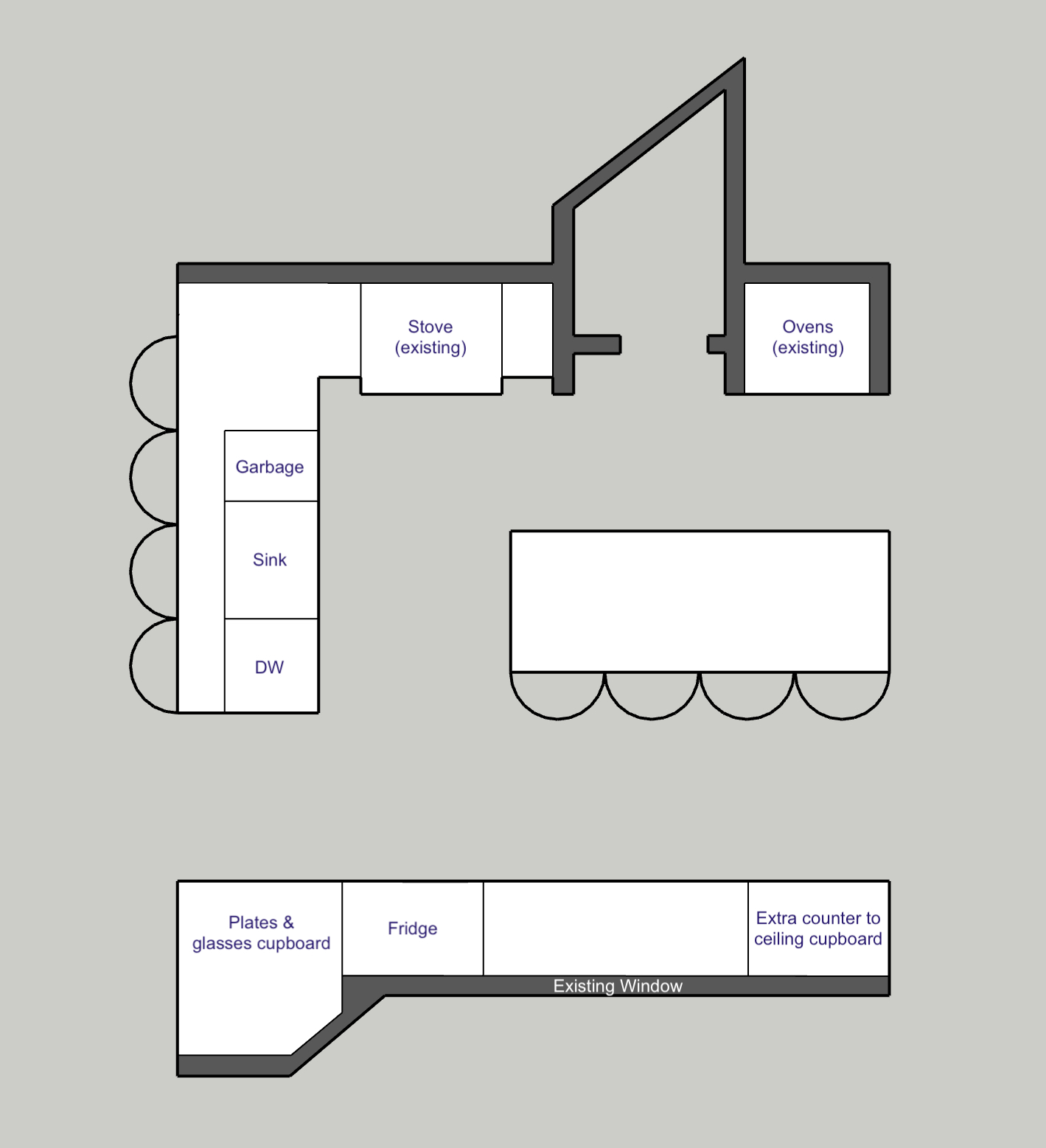
- The stove and sink are very close together for easy access between the two.
- The garbage/organics bin is conveniently located between the sink and stove, which is where the majority of waste tends to be derived.
- The fridge is within easy reach of both the sink and stove for our perfect triangle arrangement.
- The fridge is also conveniently located along the "path" wall so that it's easy to retrieve drinks for entertaining as well as meal times.
- The fridge is right beside a huge cupboard so that it's quick and easy to get a glass and fill it with either tap water or something from the fridge.
- The glasses and plates cupboard is very close to the dishwasher for easy unpacking.
- The island is huge for all the large party prepping requirements. It's also right next to the sink and stove so that washed veggies can be chopped and tossed right into a hot pan.
- The ovens are still in an ideal location, out of the way, with a drop zone also out of the way for cooling.
- The island has tons of seating for family and friends who can help with or observe the prep work.
- There is even more seating on the other side of the sink peninsula for ongoing discussion during cleanup.
- There is a clear pathway for people to walk that does not interfere with the main cooking and prep zone.
- The window is in the same position, continuing to provide ample natural light.
- There is still tons of storage. We lose a bit in the island but adding the peninsula and moving the sink there balances it out by offering more storage back on the window wall.
- The only downside is that there is a bit of plumbing expense to move the sink and dishwasher - but it's also the easiest of all the things to move. So this is still an overall winning point.
Compare out the two layouts side by side for a clearer view of the differences.





 How to Beat Overwhelm with Your Home Renovation
 The Important Documentation You Need to Guarantee a Successful Renovation